As with the formulas, I will show you an example of how to use a graph or chart in Excel 2010. I will base myself on the same example I gave with the formulas.
We left on here remember?
Ok, now we will créate a 3D column graph with the information from each month. How will I do this? Lets do it step by step:
First:
Second: After you press enter, you will get something like this:
As you can see, after you press enter in the 3D column you want to have, the chart appeared inmediately, with the information of the 4 car brands together by month.
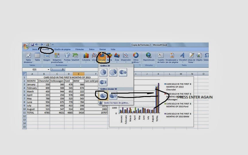
Finally we are going to make a Pie Graph with the total information sold by the 4 car brands together, like this:

Then we do this:
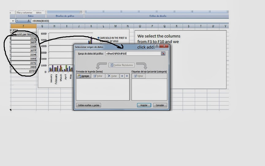
After we have clicked on select data we will have to select the info we want. In this case we choose from F3 to F10 in order.

We will get this after we press add, and we put the name of the serie, in this case Cars Sold per Month. I'm going to do two graphs for this section of cars sold per month. One pie and the other with bar.
We finally have three graphs completing in that way our Spreadsheet
And the bar graph for cars sold per month:
Hoped it helped!


No comments:
Post a Comment